MILESTONe 4
Aesthetics & Hi-Fi Prototype
Problem Statement
To create a hi-fidelity prototype utilizing a design system that outlines color, typography, iconography, and layout choices, building upon the mid-fi prototype we produced in Milestone 3.
Our team considered a few underlying principles while developing WUJO's aesthetics:
Who is our end user, and why are they using our app?
What semiotic elements will enhance our users' experience?
What colors, typography, and iconography will contribute to our goal of creating an e-commerce platform for African and Black artists and designers that emphasizes community?
Embedded in this question: are there any connotations in African culture about particular colors or symbols that we should be aware of?
Introducing Hi-Fi
Hi-fi, or high fidelity, prototypes are the iterations of a design prototype that begin to more closely resemble the realistic, usable, aesthetic characteristics of the end product. While mid-fi prototypes have recognizable characteristics, they are likely to still exist in a liminal design state; they may contain placeholders for images, boxes instead of functioning buttons, and no interactions. Aesthetics are another differentiating factor- little to no attention is paid to color, typography, or specific media, such as icons, photos, videos, and links when designing a mid-fi. These elements are incorporated in hi-fi prototypes.
Why are Aesthetics Important to Hi-Fi?
Commonly thrown around as a catch-all term used to describe visual design elements, aesthetics has been the hotly debated by academics for centuries. What exactly are aesthetics? What role do they play in life? One of the foremost philosophers of aesthetics was Immanuel Kant, whose Critique on Judgment (1790) "contained an outline of aesthetics as the understanding of design, order, and form" (Drucker & Nowviskie, 2004, p. 437). Though Kant's full explanation of aesthetics tends toward the descriptive (there are more novel, unconventional modes in which aesthetics do not always precede the observer), we believe this capacious definition aligns well with our understanding of aesthetics and can help designers think about incorporating aesthetics into their creative process.
Aesthetics, then, for a UX/UI designer are imperative. They can determine the usability of your product and greatly influence user behavior. A minimalist website layout, for example, may be ideal for an e-commerce site, where efficiency is key. However, for a surrealist painter's e-portfolio of work, a minimalist layout may be a poor branding, choice, as it does not mirror their style of painting. While users may be able to point to concrete aesthetic features they (dis)like about a site, aesthetics are fundamental to constructing a subconscious feel. For instance, a user may not actively think to themselves that they enjoy the whimsical look of color and font choices, but they may notice themselves feeling slightly happier when interacting with the site.
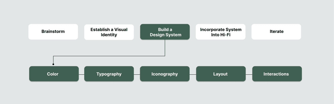
Creating a Design System
Therese Fessenden of the Nielsen Norman Group defines a design system as "a set of standards to manage design at scale by reducing redundancy while creating a shared language and visual consistency across different pages and channels." Despite the overabundance of prepositional phrases here, Fessenden nicely articulates the core purpose of a design system: visual consistency. Building a design system can only occur after establishing a visual identity, or the visual elements that distinguish a website, app, or brand. In the following sub-sections, we explain how we arrived at our design system.
A. Establish a Visual Identity with Moodboards
Before architecting the design system, our team needed to come to an agreement upon what aesthetics we should capture. Did we want to present a cool or warm vibe? Do we prefer lighter/darker, brighter/subdued colors? Should we emphasize modernity or nod toward the traditional?
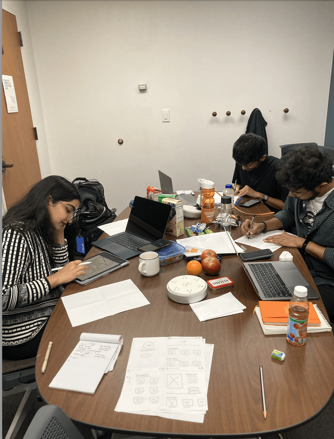
We spent about 15 minutes creating our mood boards, individually, and then we debriefed on common and disparate ideas afterward. There were diverging opinions on the topic of color; Krish and Esha favored green, teal tones to evoke growth (largely due to the painting that inspired WUJO), while Swaraj and Liz preferred earthy tones, especially burnt orange, to convey artisanship and the African landscape. On the other hand, we unanimously agreed on the feel of typography: we all liked the idea of fonts that are mostly bold with a minimally elegant flair. After discussing our mood boards, we were ready to set up our design system.

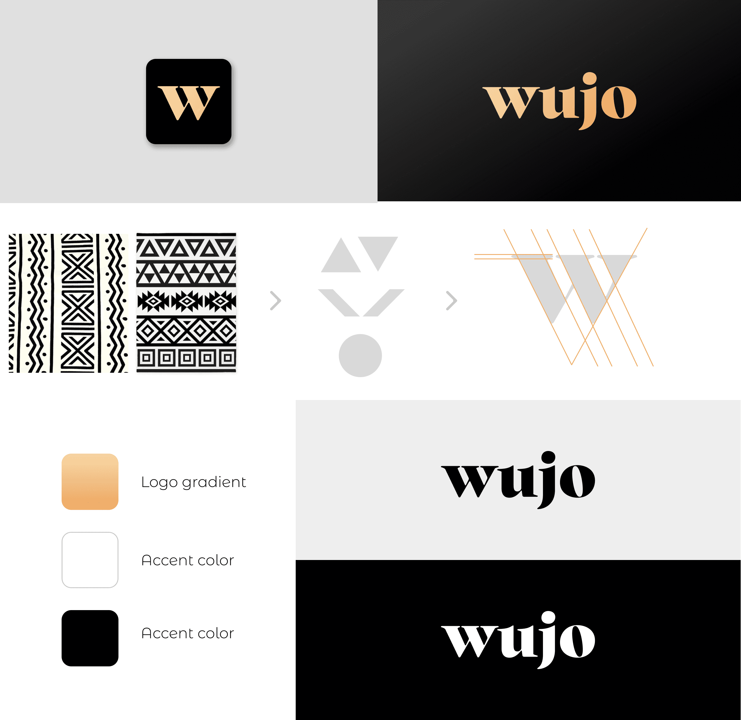
Altogether, our mood board discussion resulted in the creation of WUJO's visual identity, which will guide our aesthetics decisions moving forward.
WUJO Visual Identity Descriptors
growth-oriented, earthy, sophisticated, empowering
B. Build WUJO's Design System
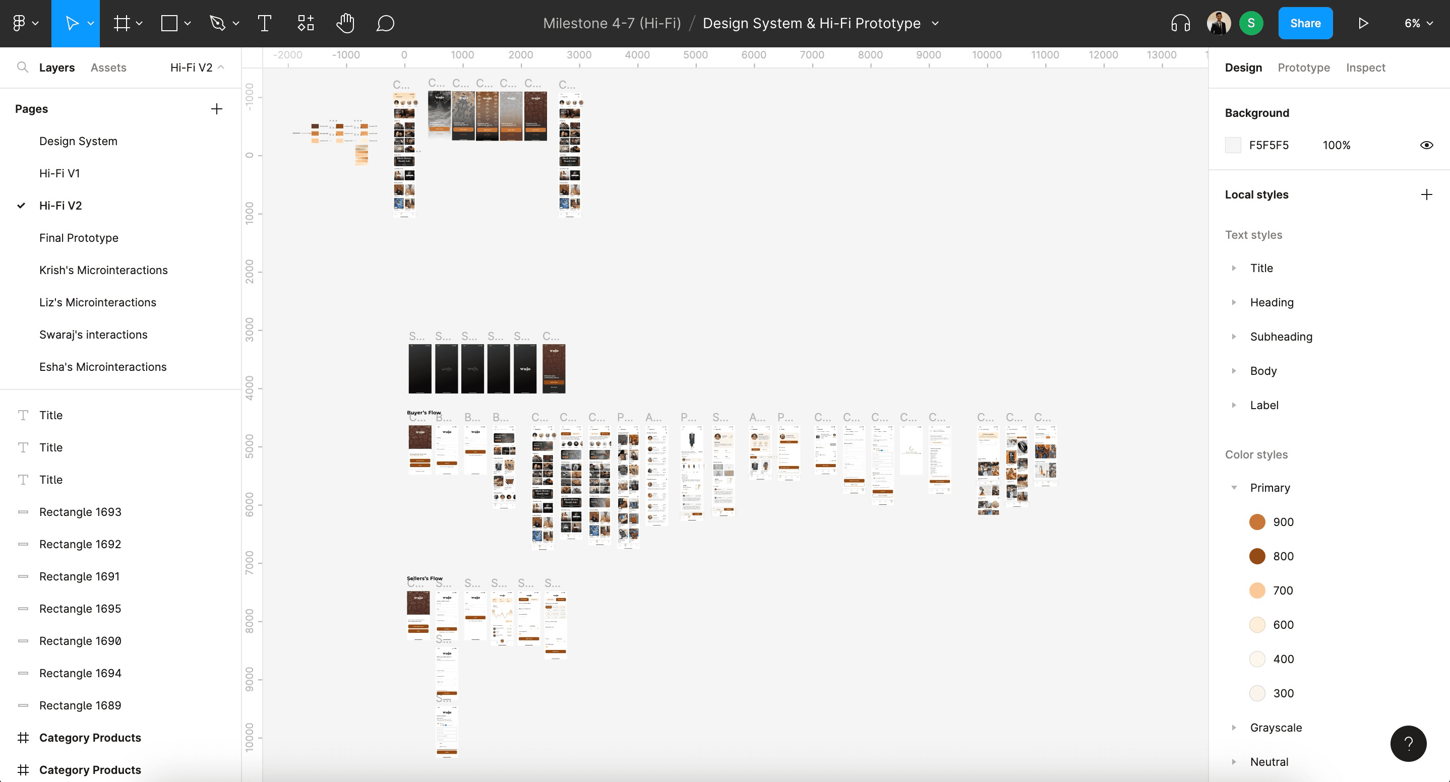
Our design system standardizes the use of: color, typography, page layouts, and iconography. We depict and explain our choices below, though the system can be reviewed in greater detail on Figma. As a note, we have not yet outlined our use of (micro) interactions, though we attempted to make page connections as consistent and straightforward as possible. We will explore interactions more in Milestone 5.
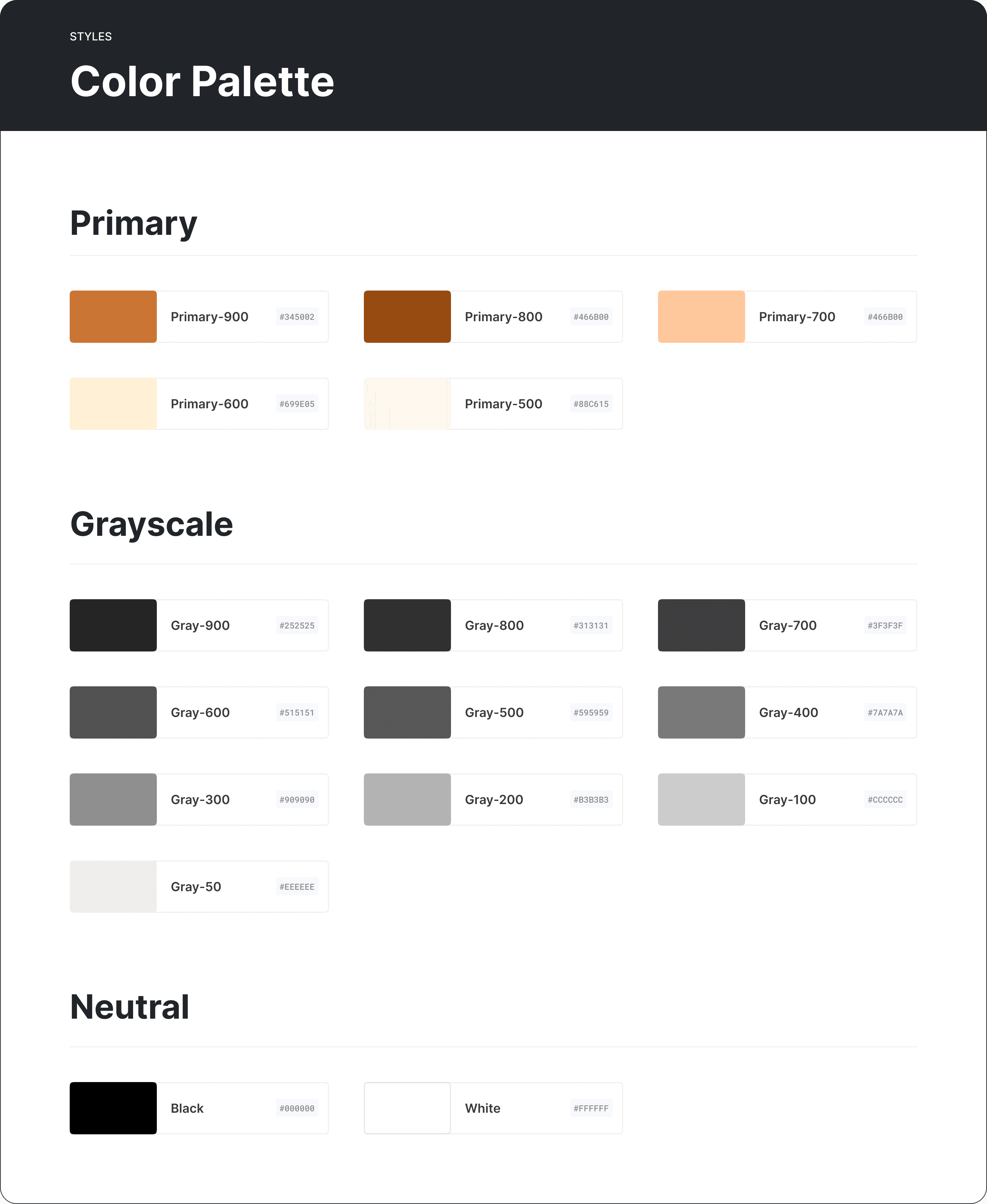
Colors
We decided that our primary color palette would be earthy oranges and browns, and shades of green would comprise our secondary colors.
Typography
We decided to use the font Montserrat for headings, as it is modern with a subtle twist that evokes mountains (as the name suggests). For body text, we chose Proxima, a straightforward, accessible sans serif font.

Layout
Our design system specifies a layout grid and spacing, which helped us maintain consistency across screens in our hi-fi. Layout specs are crucial on both web and mobile app development to ensure a smooth user experience, particularly when users are quickly clicking through screens.

Iconography
We decided upon a few key, simple icons that matched the down to earth feeling of the rest of our design system. Though it feels like many apps today use the same icons, the minute details that differentiate them can further emphasize your website's visual identity.

Initial Hi-Fi Prototype
Using our design system, we converted the mid-fi prototype from Milestone 3 into our first hi-fi prototype, which can be best viewed in the Figma links below.
Key Takeaways
Agreeing upon aesthetics is a precarious challenge when working on a team. Aesthetics are inherently subjective and can incite different reactions or feelings between individuals. Creating mood boards helped facilitate a dialogue that showed us what traits we valued most in our identity design.
Design systems save a lot of time and cognitive load. There are less decisions and errors in inconsistency to be made once a design system is in place. Everyone is following the same conventions.
That said, setting up a design system can be tedious. For an element as seemingly simple as font, delineating the size and spacing for different levels of text (e.g. headers vs. body paragraph vs. labels) takes a lot of upfront work.
For ongoing products, design systems never end. Design systems can stretch on and on. Though they commonly specify colors, fonts, icons, and layout, they can become even more granular, specifying components, interactions, and more detailed formatting choices. And even once a design system is created, designers constantly need to evaluate if specs need to be added or changed, based on the product's evolving visual identity.
References
Drucker, J., & Nowviskie, B. (2004). 29: Speculative Computing: Aesthetic Provocations in Humanities
Computing. In S. Schreibman, R. Siemens, & J. Unsworth (Eds.), Companion to Digital Humanities (pp. 431-447). Oxford: Blackwell.
Fessenden, T. (2021, April 11). Design Systems 101. Nielsen Norman Group. https://www.nngroup.com/articles/design-systems-101/